Today’s diners need a different kind of menu than in the past
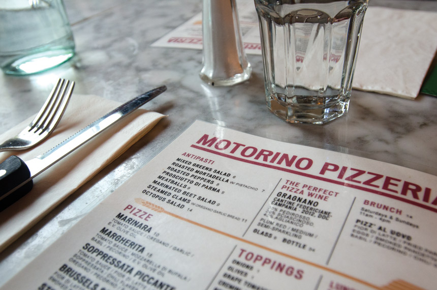
 What is the point of a menu? Does it just convey the price and the information of what the kitchen executes, or is it an opportunity to maximize a ticket average? I think we all know the answer to that, but what actually resonates with the customer?
There are so many thoughts you might have on what your menu should look like that you might end up doing a bunch of different things and landing with a convoluted mess if you aren’t careful. Or the opposite might be true — you might go so plain that it resembles a spreadsheet.
Let’s break down menu theory. It’s hard to sell a turn-and-burn product nowadays. The big boys are in a race for volume over quality, and that’s not a fight an up-and-comer has a good chance at. So being the quality pizzeria is where it’s at. Here are the nuances of a menu and notes on what to do for each:
Item names. Get a theme. Naming individual names for food items ensures you are not cookie cutter. Even at McDonald’s Nuggets are McNuggets. You could go with names of streets in town, family members, inside jokes that customers can learn as a part of the brand — all of these can all be great. But just choose one or two. For a younger college demo, funkier names work. For a higher-income range, have names that speak to the quality of the product.
Fonts, styles and item description. Times New Roman is not going to cut it. A menu shouldn’t feel like a 10th grade essay. Have a style font that matches up with your logo and brand, and then have an informational font that is easier to read for describing the item. This combo is a solid base for all printed materials.
The actual printed menu. You can go with the classic slide-in pouch in a binder with 1980’s brass edges, but you already know that look is dated. The high-end choice is to print on a thick and rough paper and change it out often. If you’re not into printing daily menus, then a thick embossed menu with the menu placed into the edges is a nice look (but a very expensive one). My suggestion is to go with what hasn’t been done. At least what hasn’t been done around you. A file folder, a distressed clipboard, elastic bands attached to a board of some kind or old concert posters with the menu written inside are funky ideas. Remember that dining out is about having a unique experience, and that needs to resonate all the way down to your menu.
Bi-fold, tri-fold or double sided. Most of time the choice of tri or bi-fold is left just for the to-go menu. If you use the same menu for in-house and to-go, it should be because you aren’t a sit-down establishment or rely on a menu board. Keep in mind: the more folds, the more complicated it is on the customer.
Price font and placement. The price on a menu can be the most or least focal thing, depending on your treatment of it. If the prices are all directly below each other or with dots leading to it, then it will pull the eye directly to price. Placing the price subtly after the menu item in a smaller font will place the emphasis on the food item as opposed to the price.
$9.95, $9.99, $10 or just 10? Along with price placement is how you convey that price. The days of $9.99 are kind of over. Not completely over, but kind of over. Rural markets and suburbs with slightly older, more family-based demographics still will go for this subconscious attempt to dissuade someone from thinking you’ve breached a certain price point. I’ve found in my more urban and city life locations that it comes across as a cheesy ploy. A straight-forward number is more on point. Regardless of which style you choose, don’t put the dollar sign in front. It pulls the brain into evaluating price and not thinking about food.
How much to charge? Is your priced based upon:
- What the other guy is charging?
- What you think it’s worth?
- What you believe the market will bear?
- Actual food cost?
 The ideal would be to set your prices based on food cost (but that might lead to items with a $12.73 price tag if you went for a straight 20-percent food cost on an item that takes $2.54 to make). You could round up or down, but do it with purpose. Don’t do anything just because the other guy is doing it, but be aware of price standards. If you are higher in price, then justify it in the ambiance, service and product quality. Don’t be afraid to charge more. Don’t apologize for making the best possible product if that is the actual truth of your product.
Photos or no photos? Photos are considered by and large passé. To-go menus can have them, but in-house menus really shouldn’t unless literacy is an issue. Photos can sell for you online and in printed items, but you don’t want to come off like a Denny’s when you are trying to be the best local pizzeria in your customers’ eyes. If you are going to use photos on a to-go menu or for online purposes, make sure of two things:
- That it is actual photos of your food, not stock photos.
- That you have a pro take them.
How to reprint. Your best bet is to have a pro do your first menu run and save it to InDesign or some type of program that allows you to easily modify the price and/or menu items. From there you can export it to a pdf, and have a print shop take care of the rest. Paying a graphic designer $100 an hour to change a few prices is a waste of money.
The nitty gritty. The real focus needs to be direct but enticing. Long stories about a few menu items and almost no description for others will come off as disjointed. When it comes to speaking more in depth of menu items, leave that to your staff to explain their take on the item with background memos on each item as a part of their training. Be yourself, be honest and be open to having a menu that is as genuine as you.
Mike Bausch is the owner of Andolini’s Pizzeria in Tulsa, Oklahoma.
